March 14 is Pi Day, when people across the country celebrate the mathematical constant π (3.14) with slices of their favorite pies.
At NHFPI, we love a good pie, too. But this year, instead of serving up blueberry, apple, or chocolate cream (yes, we’re disappointed too), our Research Team is sharing something they love even more: pie charts.
Why pie charts? They help illustrate how important data and trends are distributed and reveal insights about New Hampshire’s economy.
Below are a few of our favorite pie charts, served from our own data kitchen and a bonus from the pre-baked work of others, that help tell the story of the Granite State.
1. New Hampshire Households by Income Group
This chart shows how households in New Hampshire are distributed across income levels. It illustrates the share of households in different income brackets, including those earning under $35,000 per year and those bringing in significantly more.
Understanding this distribution helps policymakers and researchers assess how economic trends, tax policy, and the cost of living affect Granite Staters across the income spectrum.

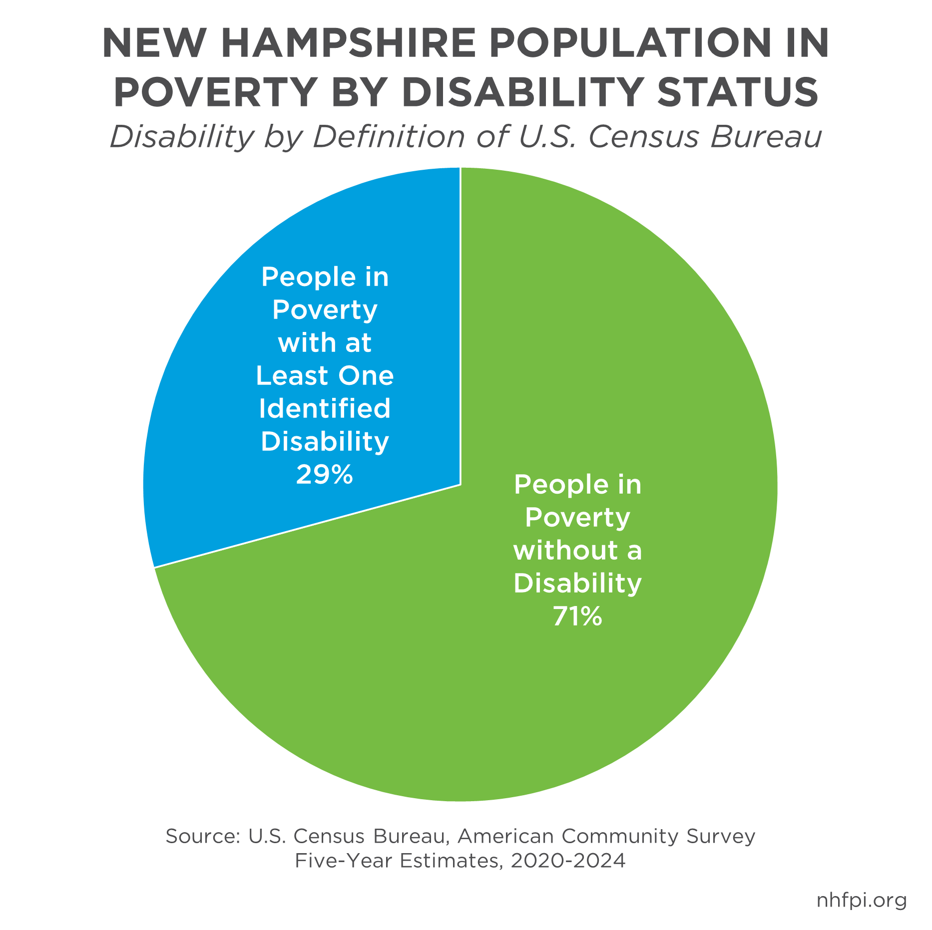
2. Poverty and Disability in New Hampshire
In New Hampshire, 29 percent of people living in poverty have at least one identified disability.
This chart highlights an important reality: disability and poverty can be closely connected. Understanding this overlap can help inform policies that support access to health care, employment opportunities, and public services for Granite Staters facing multiple challenges.
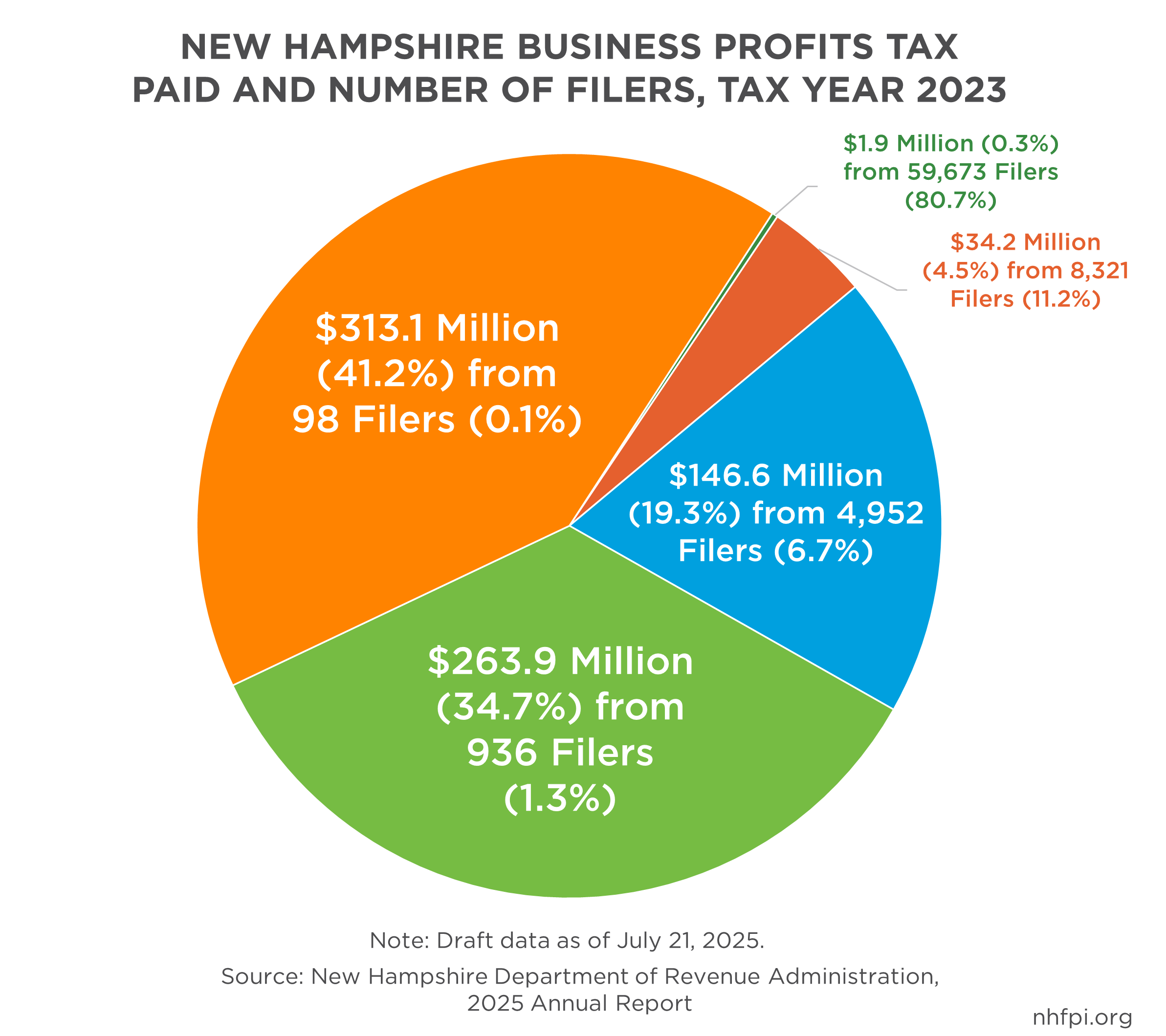
3. Who Pays the Business Profits Tax?
New Hampshire’s Business Profits Tax (BPT) is the State’s largest tax revenue sources and is paid by profit-earning businesses operating in the state, but the payments are not evenly distributed.
This chart shows that a relatively small number of filers (1,034 in tax year 2023, or about 1% of filers) paid more than three-quarters of all BPT revenue. These filers are generally larger corporations with higher taxable profits.
4. Where New Hampshire’s State Revenue Comes From
This chart breaks down the major sources of New Hampshire state revenue.
The largest share comes from federal grants, followed by other sources such as business taxes, the Liquor Commission, and the Lottery Commission. Those Liquor and Lottery Commission revenues are before expenses, such as running the liquors stores and buying the products for them, or paying for lottery and gaming winnings.
Understanding the mix of revenue sources is key to understanding how the State Budget is funded and how policy decisions can impact public services.

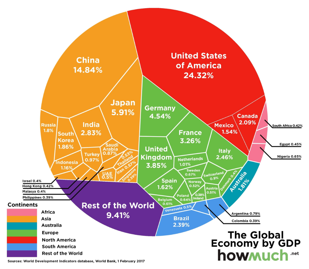
5. The Size of Global Economies
Not all pies are perfectly sliced.
An old favorite of one of our staff members, this visualization of data from the World Bank and compiled by a financial analysis website compares the relative size of national economies in 2017. The measure used is Gross Domestic Product, a common measure of the size of an economy, and shows how much larger some economies are than others. While not a traditional pie chart, it illustrates an important concept: economic activity is not evenly distributed across the globe.
These kinds of comparisons help provide context for understanding where resources are allocated within the broader global economy.
Happy Pi Day from NHFPI
Whether it’s pie charts, bar graphs, or maps, good data visualization helps make complex policy issues easier to understand.
And while we may not be serving actual pie today, we hope these charts help provide a well-rounded picture of the data behind the policies shaping life in New Hampshire.
Happy Pi Day!